
Bloglines has been pushing their new beta site, beta.bloglines.com, and are already reporting many satisfied users. The new site is very attractive and much more modern looking, but do not count me among the satisfied.
The new beta, as far as I’m concerned, is just a second rate Google Reader. In fact, everything about how Bloglines works has been changed to emulate Google Reader.
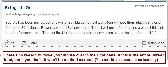
My primary gripe is this: in the normal Bloglines, you click on a feed and the items are marked read. In the new version, you must scroll past each item and/or click on each item. If I click on a feed with one or two short items, then I click a new feed, those items are not marked “read” and stay in my lefthand sidebar. I do not care to address each item individually, which is what the new system requires.
Also, even if I do scroll over each item, more often than not, the last item is not “marked read” and remains for me to address later.
There are a host of other single key shortcuts, and I do find these useful, but make no mistake about it, these single key shortcuts are “borrowed” directly from Google Reader again.
 Most of my gripes with beta 1.0 were not addressed in today’s update. It was hard to click on a feed properly – the linked area was a bit flaky. Each element in the feed bar had a display of “block,” which I think lead the developers to think it would be easer to locate the right feed quickly with your mouse. However, the second part of my complaint was that without underlines in the feedbar on mouseover, there was no way to tell, except via the hand cursor, that you’re on the right link. The UI ought to indicate that you are on an active link via an underline. Since it does not, and still does not, you’re still floating above a huge link sea.
This is only compounded by the fact that the current version uses a simple Arial font, whereas the new uses what I suppose Bloglines thought was a more “Web 2.0” font, which I think I’m properly id’ing as Trebuchet.
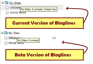
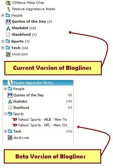 As a result, it’s harder to figure out what means what in the feedbar. Notice that in the example, on the current site, the bolder headlines mean unread items exist. There is a clear number right beside the feed telling you how many items are pending. But in the new Bloglines beta, the bolding is much less noticeable due to the font change and the number of unread items is right justified, which means you can’t easily tell how many are pending when you have a large number of feeds with unread items.
Overall, it’s a very nice start – it’s attractive, it’s got nice drag-n-drog javascript everywhere, it loads in a decent amount of time, and the new customizeable start screen is very cool. But if this is what rolled out as final, I’d probably just move to Google Reader, which is practically the same thing anyway. This is just too much like it and pretty much ditches all the concepts that I *liked* about Bloglines that made it different.
I’ll look into adding the mouseover effect you mentioned lacking in beta. Also we are aware of the problems with readability in the feedtree on the left. Thanks for giving it a try though. We’re working hard to making something you like. It’s true that a lot of what we have is similiar to Google Reader, but we’re also innovating in places such as the different views. The short cut keys are actually inspired by vim, the text editor (for Google also). 😉