Since we’re getting close to a usable version of OSNews 4, I thought I’d post a few sneak peek screenshots of the next version of OSNews. This is somewhat silly, because the interface is based on CSS, so it can and possibly will change significantly (it’s more important to get the PHP sorted out than the CSS, up front at least). But nonetheless, by the end of next week, v4 will be close enough for me to switch to it full time. If you click the “Read More” link, you’ll see several sections of screengrabs from the site as it stands today.

Click the image for a full size view
This is the current view of a reply comment. Note that when you quote a parent comment, it is now given its own style, different from the [i] tag. Also, note the avatar and the “Member Since,” which will replace the average score following a username. The average score method was useful, but also flawed, because new users could have deceivingly high averages.
 To the right is the current template for a news story. It’s pretty standard, not much to see, but you will notice the “star” to the right, which is currently “on.” Starred stories are different from recommendations and function like a bookmark, much like the concept of “starring” in Gmail.
 Each person’s profile includes a page of RSS feeds (more will follow) specific to that user. Custom RSS feeds are cached on demand and then retreived from cache for the next 60 minutes, after which a subsequent request will reload the cache. The number one RSS feed for me? A feed of the stories my friends have recommended.
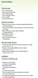
 This is the current sidebar for OSNews. There will definitely be more information in it, and very likely an advertisement. The sidebar not only features your profile navigation, but also links to recent comments and recent original stories. The new layout includes a prominent link to original stories.
Note the headlines at the bottom, which can be changed dynamically. Currently, we’re offering three headline sources: OSNews Staff, OSGalaxy, and Gnomefiles. It’s possible we may offer additional feeds in the future or maybe even at rollout.
This list is current feeding from static HTML files, but it’s very likely that by the time the site is live, the static file will be parsed by server scripts from RSS feeds. If this is the case, we will be loading several other feeds for headlines. If you have suggestions for feeds you’d like to see there, please leave them in the comments of this story.
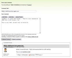
 Last but not least is this shot of a work very much in-progress: the comment screen. If your comment is a reply to another comment, you can quote the parent comment by clicking a button. Furthermore, there is a comment preview button that will show the preview inline below your comment form and allow you to see exactly what it will look like (the [q] tags aren’t parsing in the preview YET, but they will). I’m really happy with this form, and it’s really a major improvement over the current form with the javascript popup preview, which I never use, even if it is a nice javascript. I’m particular pleased with some of the javascript we’ve got that doesn’t use AJAX. Some of the interactive dynamic tricks we use are exclusively client-side, which means even fewer page loads, which means a better, faster server and overall OSNews experience.
If you’re interested in OSNews 4 stories, please leave a comment and let me know to keep posting them.

You took the Google star (yellow with a blue outline).
Almost all images on the v4 dev site are placeholders. Any might be changed before we go live.
So did Mark himself for use in Launchpad and I don’t see anyone complaining.