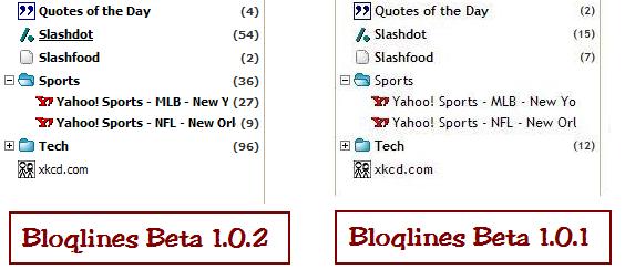
The other day, I griped about the new Bloglines beta. To my surprise and enjoyment, one of the Bloglines developers left a comment, and we exchanged a few short emails. Today, Bloglines releases beta 1.0.2, and guess what? My issues were specifically addressed! Let’s examine:

So what do we see? The font that made it impossible to distinguish bold from normal weight text? Gone. Now we have a beautiful font that makes it very clear which are read and which aren’t. How about the visual indicator of which item you are hovering over? It’s there!
My biggest gripe was that items were only marked read on hover and by a keystroke, just like Google Reader. But what do I see in the teaser for 1.0.3?

Hey-o! Score one for the Bloglines team! Way to utilize reader feedback! Nice work.
